- Live Chat
- Call Today: +91 72039 81134
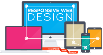
Responsive Web Designing
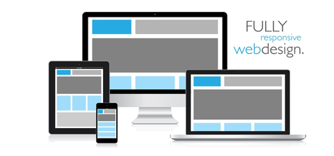
All Inclusive Website that works on all devices...
Responsive Web design is advancing according to which the design and development is required to respond to behavior and user environment based on screen size , platform and orientation . In simple words , Web Design Sensible is one of the best design concepts -up -to- the-minute websites that respond accurately to each type of device that accesses it while providing appropriate output to fit the size of screen required .
We only art and cleanly designed, meticulously developed, content-rich Web sites that run on the desktop first and are compatible with most mobile devices. Once we understand your business and your objectives we will create an experience that helps clients solve their problems and make sure they keep coming back for more.
We got into the sensitive web design, do not look or be fashionable, but because we truly believe that should be done in the way websites. This is an opportunity for us to finally embrace the dynamic environment is now available there.
Design is a fantastic response to the development of a mobile ready website method. Although it may not be the case every time. What is? Resize the browser window now see the contents responsive and appropriate. Cool eh! We worship built quite sensitive, but we do our research and make sure that is ideal for your needs first. We are also interested in the development of interfaces for websites fluids.
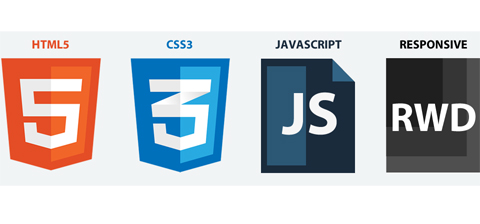
css3 html5 Responsive Design
Navigations
Get in touch with Us